Jak to bywa z lepszymi pomysłami, jego rodzicami okazali się być matka oszczędność i ojciec niezdecydowanie. Gromadzenie nieużytych resztek farby pozostałej po malowaniu, balansuje pomiędzy mieszczańską zapobiegliwością, a potencjalnym problemem ze zbieracko-łowieckim komponentem osobowości.
Nie trudno dostrzec, że w obrazie część kompozycji jest istotniejsza pod względem dynamiki i koloru od reszty, tak długo jak ta nie wchodzi za bardzo w paradę pierwszoplanowym elementom. Jednak zawsze problem sprawiało mi ustalenie, jaka dokładanie barwa powinna znaleźć się w mniej istotnych miejscach, gdyż możliwych, neutralnych odcieni jest multum. Kolor zero powstał jako rozwiązanie, które miało pomóc mi przełamać zarówno jakiś konkretny impas decyzyjny (czyli pozwolić wyjść z pracowni). Jednocześnie stał się powtarzalnym wątkiem, który zacząłem wplatać w różnorodne prace, umożliwiając ich koncepcyjne zetknięcie się. Pozostając tym samym pojęciem, jego kolor ewoluował pod wpływem tego jakie barwy dobierałem. Jako kolor neutralny zmieszany z rożnych barw, jest naraz ich sumą i idealną wypadkową, pozostaje optycznie dopasowany do preferowanych przez mnie zestawień kolorów. I najważniejsze – nierozerwalnie związane ze sztuką myślenie o ekonomii działań i środków (tzw. $$$) , zostaje jednolicie sklejone z przestrzenią obrazu, a praktyka malarska bazująca od zawsze na recyclingu idei i form zyskuje równoważnik pod postacią recyclingu materii. Oraz pozwala mi wypełnić farbą przestrzenie płótna, które powinny być zapełnione, nie poświęcając za dużo czasu na decyzje, a zachowując poczucie, że trafiłem we właściwą barwę.
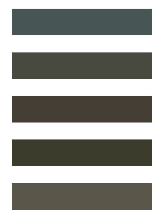
Powyżej – zmiana barwy koloru zero w kilku odsłonach z ostatnich dwóch lat.
Color Zero
Just as it happens with better ideas, its parents turned out to be mother frugality and father hesitance. Saving the unused leftovers of paint, is somewhere between bourgeois foresight and a potential problem with hunter-gatherer component of personality.
It’s not that hard to see, that in painting a part of composition is more important in terms of dynamics and color than other, as long as this other part doesn’t get too much in a way of the foreground elements. Yet it was always troublesome for me to decide what exact hue should be in these less important places, for there is a multitude of neutral shades. Color zero came as a solution that was to help me to break past some certain impasse of decisions (that is allow me to get out of the studio). At the same time it became a thread, that I started to weave into different works, allowing them to touch as ideas. While remaining the same concept, its color evolved depending on what paint I chose. As a neutral color mixed of different hues,it is both sum of and their perfect resultant, naturally matching color profiles preferred by me. And most important – thinking about the economy of action and means inseparably tied to art (ie $$$) is seamlessly incorporated into the space of painting, while praxis of painting that is perpetually based on recycling of the ideas and forms, gains a counterpart in shape of recycling its matter. And color zero allows me to cover with paint the spaces of painting that need to be painted over, without giving too much time for decisions, yet feeling that the color matches.
Above – changes of the color zero in a few steps over last two years.
